April writing...
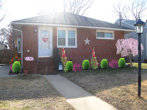
So...I need to know how to plan out my garden, I have new plants headed my way...as well as some lovely spring weather and I am ready to get started! So I figured I would put my minimal photoshop skills to the test and create a man-made design board so I could virtually move around the plants to design the best look.
So some of these are just ideas...some I love...we shall see. Let me know your thoughts!!!
Let's start with the back fence look. (and yes...I added in the fluffy trees!) I have always loved topiary's and I think they would be a perfect addition. We will be putting gravel on the side of our driveway...easiest maintenance.

My simplified version of the Side planter...using two of the current plants I have...the Hostas and the Boxwoods (well, we actually have Eyonomous...but I plan to switch those out for a more sturdy box evergreen) I like it...it's simple...but my heart yearns for MORE color!! and some HEIGHT!
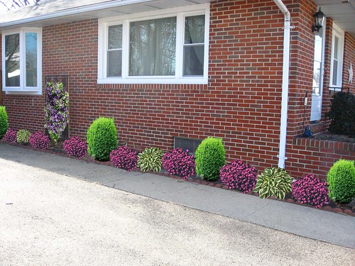
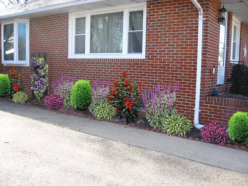
But then...this is too much height and too much color I think. Ehhhh...hmmm...
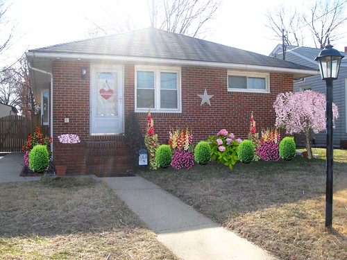
And here's the front planter with a new Weeping Cherry tree...I want one SO bad!! With lots of color and height...but Cory says it's too much...and I kind of agree...boo.
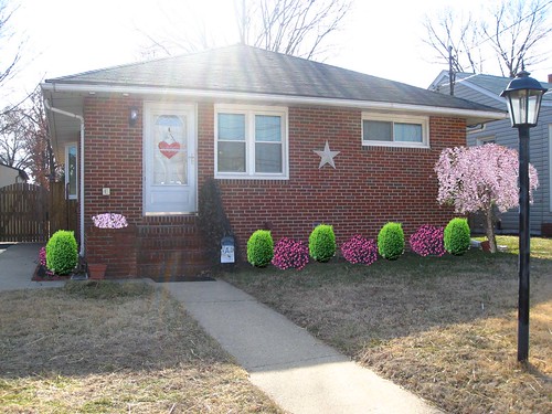
So here we are simplified...matching the simplified plan for the side planter...but is it too blas'e??!!
So, here's Cory's version...with a little height...and color...but then I realized I didn't order Hollyhocks...I was too worried because I heard that they were poisonous to dogs. How bad would I feel right?? Killing poor doggies for a little color boost in my garden. But I could find other plants with height right?!



3 comments:
So... I love your ideas, but do agree. On teh side shot, not too much height, but def too much color in the one pic (you know which one I mean, right?). As for the front, I LOVE the weeping Cherry tree (I want one now, too - to replace our UGLY front yard tree), but maybe you shoudl put it a LITTLE further out, so as it grows, it won't have to be lopsoded due to the house and having to trim it. ya know? I love it, though. And I agree about the holyhocks. What if Pickle or Olive get out on accident and chow down on it. NO FUN!!
Maybe go for less of a patterned look, and more of a symmetrical look? That may add a few more possibilities for you.I'm just thinking out loud, here...
I is confusied! But I can say that I like the second picture...and the first front one I like too!
I like side picture #1 and front picture #2. I know they are not filled with height, but the colors are really nice against your brick.
Post a Comment